
How to create an input field with integrated select element
In this guide we will show an example on how we can create an input field with integrated select component in React. I got the inspiration from our recently published open source project, our currency converter.
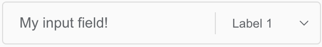
Final result
Implementation
So, let's begin with creating our wrapper.
<div className={style.inputContainer}></div>
And the styling will be as follows
.inputContainer {
  position: relative;
  display: flex;
  align-items: center;
  border: 1px solid #ddd;
  padding: 0.5rem 1rem;
  border-radius: 4px;
  width: 300px;
}
And now, let's add our input and select. We will wrap our select element in a seperate div to place it at the end of our component.
<div className={style.inputContainer}>
  <input className={style.input} type="text" />
  <div className={style.selectContainer}>
    <select className={style.select}>
      <option>Label 1</option>
      <option>Label 2</option>
    </select>
  </div>
</div>
And styling will be as follows
.input {
  border: none;
  width: 100%;
  font-size: 14px;
  padding: 4px 8px;
  outline: none;
  color: #5f6368;
  background-color: transparent;
}

.selectContainer {
  display: flex;
  align-items: center;
  flex: 0;
  width: 100%;

  .select {
    border: none;
    outline: none;
    color: #5f6368;
    font-size: 12px;
    padding: 4px 18px 4px 24px;
    border-left: 1px solid #ddd;
    background-color: transparent;
  }
}
Note that we are setting outline: none;. It will look weird with the highlight border when we have the input and select inside of our container which already has a border.
Safari...
All right, now it all looks great. Unless you are using Safari browser and the result looks like this...
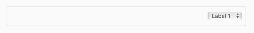
Not so pretty, right? Let's fix this.
Fix Safari styling
All right, let's fix this issue. In our styling, let's add two more properties in our .select class.
.select {
  border: none;
  outline: none;
  color: #5f6368;
  font-size: 12px;
  padding: 4px 18px 4px 24px;
  border-left: 1px solid #ddd;

  -webkit-appearance: none;
  appearance: none;
}
All right, that'll fix it.
However, now our arrow disappeared... Let's fix that as well.
Add our arrow
We will add an icon ourselves to our component. You can find the icon here.
Add <img /> to select container
Let's add our arrow icon to the component
<div className={style.inputContainer}>
  <input className={style.input} type="text" />
  <div className={style.selectContainer}>
    <select className={style.select}>
      <option>Label 1</option>
      <option>Label 2</option>
    </select>
    <img className="expandIcon" alt="icon" src={expandIcon} />
  </div>
</div>
And in our stylescheet, we add this class.
.expandIcon {
  position: absolute;
  right: 8px;
  height: 18px;
  width: 18px;
}
Full stylesheet
.inputContainer {
  position: relative;
  display: flex;
  align-items: center;
  border: 1px solid #ddd;
  padding: 0.5rem 1rem;
  border-radius: 4px;
  width: 300px;

  .input {
    border: none;
    width: 100%;
    font-size: 14px;
    padding: 4px 8px;
    outline: none;
    color: #5f6368;
    background-color: transparent;
  }

  .selectContainer {
    display: flex;
    flex: 0;
    width: 100%;

    .select {
      border: none;
      outline: none;
      color: #5f6368;
      font-size: 12px;
      padding: 4px 18px 4px 24px;
      border-left: 1px solid #ddd;
      background-color: transparent;
      -webkit-appearance: none;
      appearance: none;
    }

    .chevron {
      position: absolute;
      right: 8px;
      height: 18px;
      width: 18px;
    }
  }
}
Outro
That's it. Now we have created our input with an integrated select, with cross browser support. I hope you liked this guide, and hope to see you in more of our articles.
Have a great day!
 Fri Apr 28 2023
 Webcam component in React for taking photos that can be downloaded or sent to an APIA tutorial on how we can create a component that accesses the webcam and take photos. We will make the image downloadable and prepare it to be added to form data to POST it to an API.
 Update state in React for objects and arraysA guide on how to work with objects and arrays in React states. We will remove, add and update enitities in the state and explain the cause of mutation in React states.
 Implement an add to cart feature in ReactA tutorial on how to implement an add to cart feature for a webshop, using React, context API and JavaScript
 Create a QR code generator in ReactA tutorial on how to build a QR code generator in React using a free API from Algobook.
 Tabs component in React with icon supportIn this tutorial we will create a Tabs component that we can use in our application for showing different type of content.
 Build a full stack application with React and NodeJsA tutorial on how to build a simple full stack application with React in the client side and NodeJs in the backend.
 How to make pages in React scroll to top automaticallyA short tutorial on how we can make our pages always scroll to the top once navigated to. We will create a custom hook that we can implement in our pages.
 Create a contact us form in React with email integration using a free APIA tutorial on how we can create a contact us form with just using React with a 100% free Email API integration.
 Create a responsive sidebar menu in React with a visibility toggleA tutorial on how to create a responsive sidebar in React with icons, links, visibility toggle and a slide in animation. We will also share example how to get it to work with react router dom using NavLinks.
 A react component for displaying Adsense adsA guide on how we can create a component in react for displaying ads from Adsense
 How to achieve a typing animation on a textA short tutorial on how to achieve a typing animation effect on a text, using css and React.