Create a Tabs component in React with icons
In this tutorial we will create some tabs that we will use in our application to separate our content. Our tabs will be fully responsive and support icons.
This is closely related to our filter tabs component guide, so if you are looking for filtering tabs, check that guide out.
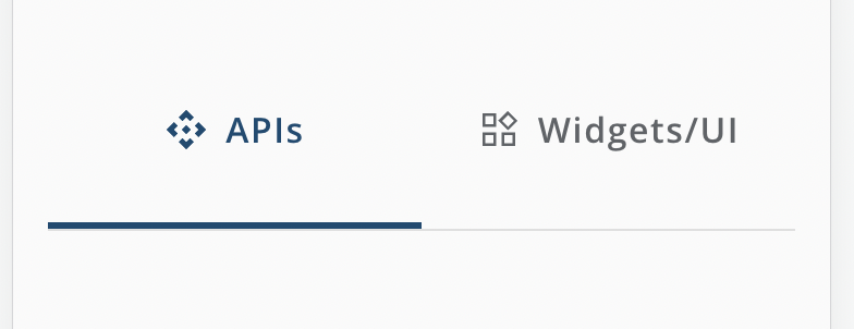
Final result
After this tutorial, we will have something looking like this on our desktop version:

And on mobile:

Set up our project
In this tutorial, we will use a project that has React with TypeScript and sass setup, if you want a super quick guide on how to do that, check this out.
Create our TabBar.tsx
We will start by creating our TabBar.tsx and TabBar.module.scss files, and structure our props that we want it to get provided with.
import styles from "./TabBar.module.scss";

interface ITab {
  label: string;
  id: string;
  icon: {
    default: string;
    selected: string;
  };
  isSelected: boolean;
}

interface ITabBarProps {
  tabs: ITab[];
  onTabClick: (id: string) => void;
}

export const TabBar = (props: ITabBarProps) => {
  return null;
};
We expect the consumer of our component to pass in an array of ITab objects and a callback function for what should happen when the tabs get clicked on. We want our tabs to have a unique id, a label, a selected state and also some icon configs for which icon should be shown when selected or not selected.
Render our tabs
Now we will create our rendering for the tabs. In the our component, add following:
export const TabBar = (props: ITabBarProps) => {
  const { tabs, onTabClick } = props;
  return (
    <div className={styles.tabs}>
      {tabs.map((tab) => (
        <div
          onClick={() => onTabClick(tab.id)}
          className={`${styles.tab} ${
            tab.isSelected ? styles.selected : null
          } ${tab.isSelected}`}
          key={tab.id}
        >
          <img
            alt="icon_tab"
            src={tab.isSelected ? tab.icon.selected : tab.icon.default}
          />
          {tab.label}
        </div>
      ))}
    </div>
  );
};
So what is happening here is quite straight forward, we are looping through our tabs and returning a <div> with an <img> and the label and depending on the isSelected value, we are applying the correct styling and icon.
Full code
Our TabBar.tsx should now look like this:
import styles from "./TabBar.module.scss";

interface ITab {
  label: string;
  id: string;
  icon: {
    default: string;
    selected: string;
  };
  isSelected: boolean;
}

interface ITabBarProps {
  tabs: ITab[];
  onTabClick: (id: string) => void;
}

export const TabBar = (props: ITabBarProps) => {
  const { tabs, onTabClick } = props;

  return (
    <div className={styles.tabs}>
      {tabs.map((tab) => (
        <div
          onClick={() => onTabClick(tab.id)}
          className={`${styles.tab} ${
            tab.isSelected ? styles.selected : null
          } ${tab.isSelected}`}
          key={tab.id}
        >
          <img
            alt="icon_tab"
            src={tab.isSelected ? tab.icon.selected : tab.icon.default}
          />
          {tab.label}
        </div>
      ))}
    </div>
  );
};
Styling
Let's give our TabBar some styling as well. In our TabBar.module.scss, add following:
.tabs {
  display: flex;
  justify-content: center;
  border-bottom: 1px solid #dfdfdf;

  .tab {
    display: flex;
    flex: 1;
    padding: 2rem;
    align-items: center;
    justify-content: center;
    font-weight: bold;
    color: #5f6368;
    cursor: pointer;
    min-width: 90px;
    border-bottom: 3px solid transparent;
    gap: 0.5rem;
    font-size: 18px;

    @media only screen and (max-width: 600px) {
      font-size: 16px;
    }

    img {
      height: 20px;
      width: 20px;
    }
  }

  .selected {
    border-bottom: 3px solid #104b72;
    color: #104b72;
  }
}
Consume the component
Now it is time for consuming our component. If you want great icons, check out google fonts where you can download all types of icons for your project.
In our HomePage, or wherever we want to use our tabs, we start by importing them:
import { TabBar } from "./TabBar";
And then, we want to create two (or more) different types of views for our tabs. I will go with home and latest where I pretend I have a blog or something :)
import { TabBar } from "./TabBar";

const TAB_FILTER = {
  home: "home-filter",
  latest: "latest-filter",
};

const HomePage = () => {
  return null;
};
Then, we will create a state that will keep track of which view we should show, we will show home tab as default
const HomePage = () => {
  const [view, setView] = useState(TAB_FILTER.home);
  return null;
};
Next, we will create a render function for checking what to render on our page
const HomePage = () => {
  const [view, setView] = useState(TAB_FILTER.home);

  const renderView = () => {
    if (view === TAB_FILTER.home) {
      return <div>HOME VIEW</div>;
    } else {
      return <div>LATEST VIEW</div>;
    }
  };

  return <div>{renderView()}</div>;
};
And at last, we will create our tabs so we can toggle between our views
return (
  <div>
    <TabBar
      onTabClick={(tabId) => setView(tabId)}
      tabs={[
        {
          id: TAB_FILTER.home,
          label: "Home",
          icon: {
            default: "/icons/home.svg",
            selected: "/icons/home-selected.svg",
          },
          isSelected: view === TAB_FILTER.home,
        },
        {
          id: TAB_FILTER.latest,
          label: "Lastest stuff",
          icon: {
            default: "/icons/latest.svg",
            selected: "/icons/latest-selected.svg",
          },
          isSelected: view === TAB_FILTER.latest,
        },
      ]}
    />
    {renderView()}
  </div>
);
And there we go. Now you should see two tabs and also being able to toggle between the different views.
Pro tip for the svg
To change the color of the svg to get more highlighted, simply add fill="#104b72" to the "selected" svg so it will reflect the color of the selected tab.
<svg xmlns="http://www.w3.org/2000/svg" fill="#104b72" height="48" viewBox="0 -960 960 960" width="48">
  <path d="M480-375 375-480l105-105 105 105-105 105Zm-85-294-83-83 168-168 168 168-83 83-85-85-85 85ZM208-312 40-480l168-168 83 83-85 85 85 85-83 83Zm544 0-83-83 85-85-85-85 83-83 168 168-168 168ZM480-40 312-208l83-83 85 85 85-85 83 83L480-40Z"/>
</svg>
Outro
That's it for this tutorial. I hope you enjoyed it and that you got closer to getting tabs into your project. Tabs are really handy when we want to show much content on a page, but still want to divide it into sections in order to make the page as user friendly as possible and not bombard our visitors with too much stuff.
Thanks for reading, and have a great day!
 Sun May 28 2023


