
How to create a responsive sidebar in React with icons, links and a toggle for visibility
In this tutorial, we will create a sidebar in React that is responsive to work on both mobile and desktop. We will add some google font icons from here, and also apply some cool slide in animation. We will share two example, one by using plain <a /> tags and one that are using react-router-dom <NavLink /> to handle the navigation.
If this component doesn't work in your project, you are very welcome to contact me and we can see if we can solve it together so you can get it to work in your application.
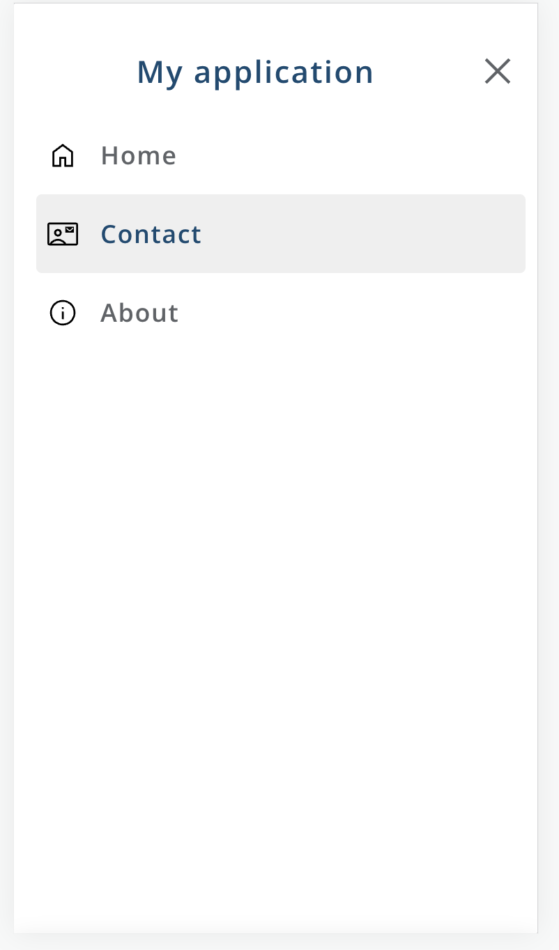
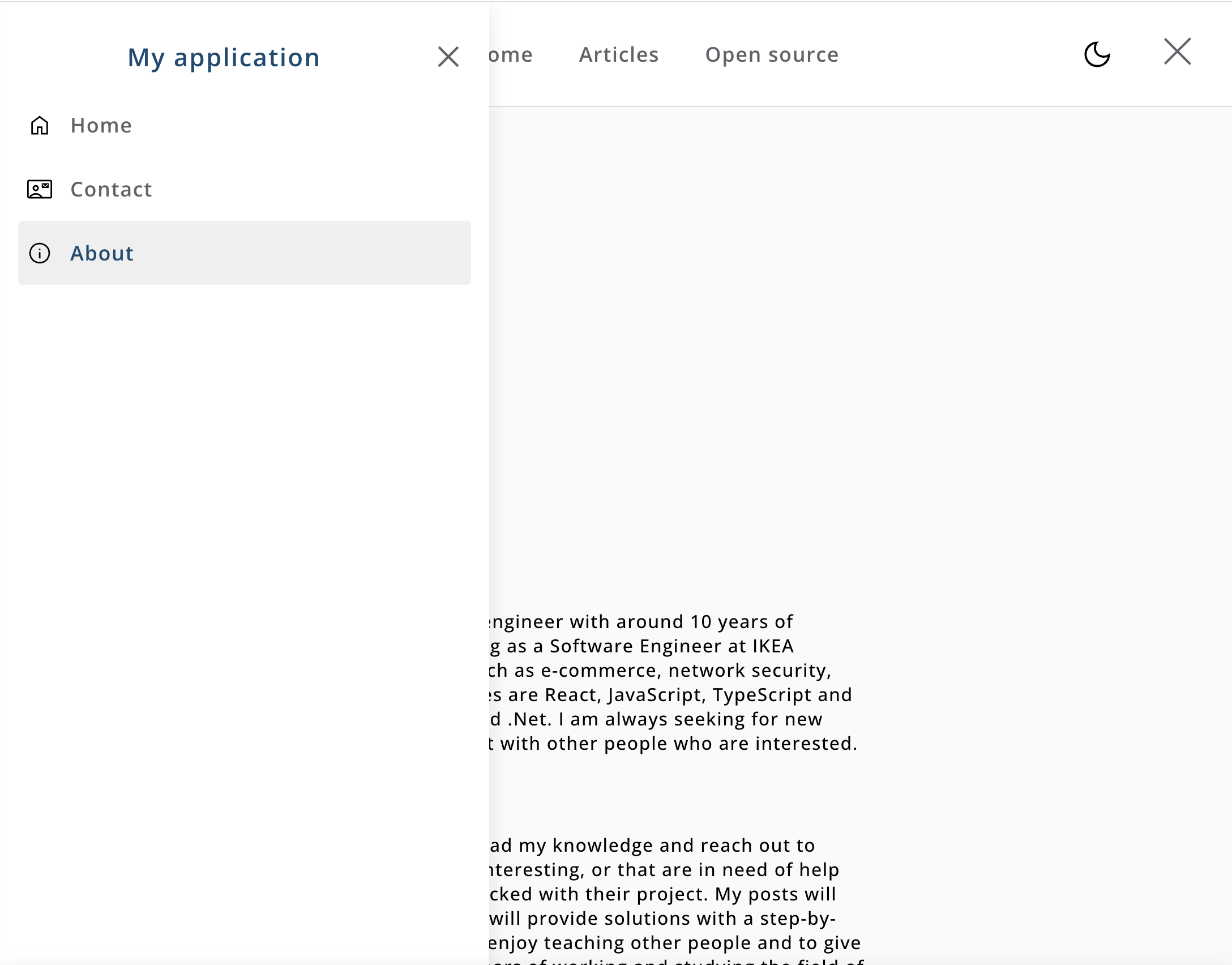
Final result
The final result will look something like this
Mobile
Desktop
Set up a React project with sass modules (optional)
If you haven't setup a project yet, we can simply create a new project using create-react-app
npx create-react-app react-dom-example --template typescript
And to support sass modules
npm install sass
Note that I am using typescript here, it is not mandatory, but I highly suggest to do so since it comes with a lot of benefits when it comes to clean code and everything.
Create our Sidebar component
Let's cut to the chase and create our component. Create a file called Sidebar.tsx or .jsx if you are not using TypeScript. Guide on changing your current project to TypeScript can be found here.
We will start by our example of using plain <a> tags and handle the logic for checking if it is active or not by ourselves.
import { useCallback } from "react";
import style from "./Sidebar.module.scss";

interface IItem {
  label: string;
  path: string;
  icon: string;
}

interface ISidebarProps {
  items: IItem[];
  isVisible: boolean;
  onMenuClose: (event: React.MouseEvent<HTMLElement>) => void;
}

export const Sidebar = ({ isVisible, items, onMenuClose }: ISidebarProps) => {
  const isActive = useCallback((item: IItem) => {
    const paths = window.location.pathname.split("/");
    return paths.find((path) => `/${path}` === item.path);
  }, []);

  return (
    <div className={`${style.sidebar} ${!isVisible ? style.collapsed : ""}`}>
      <div className={style.collapseContainer}>
        <span className={style.text}>My application</span>
        <img
          onClick={onMenuClose}
          className={style.icon}
          src={"/icons/close.svg"}
          alt="close-icon"
        />
      </div>

      <div className={style.items}>
        {items.map((item) => (
          <a
            className={
              isActive(item) ? `${style.item} ${style.activeItem}` : style.item
            }
            key={item.label}
            href={item.path}
            onClick={(event) => onMenuClose(event)}
          >
            <img className={style.icon} src={item.icon} alt="icon" />
            <span className={style.label}>{item.label}</span>
          </a>
        ))}
      </div>
    </div>
  );
};
There we go. Let's dig into the code and see what is going on.
-
First we are setting up our interfaces, if you are not using TypeScript, skip this step.
-
Note that we are passing in the visibilty state from outside. And when closing the component with the click, we are calling a callback. The component should be as dumb as possible and let the consumer handle the logic.
-
In our component, we are creating a function with useCallback hook to check if our link is active. If you are using react router dom, our next example will show how we can do this automatically using <NavLinks />.
-
Render the component
Using React router (optional)
I just want to share how we can use react router to handle the links and get greate utilities such as checking for active state etc.
-
Remove our isActive function at the top of the component
-
Change our <a> tags to following code
import { NavLink } from "react-router-dom";

<NavLink
  className={({ isActive }) =>
    isActive ? `${style.item} ${style.activeItem}` : style.item
  }
  key={item.label}
  to={item.path}
  onClick={(event) => onMenuClose(event)}
>
  <img className={style.icon} src={item.icon} alt="icon" />
  <span className={style.label}>{item.label}</span>
</NavLink>;
And now we get the functionality for checking the active tab, and also a smoother linking experience.
Styling
Let's style our component. In the stylesheet, add following code. We are using sass modules in this example, but css will work as well. Setup sass modules in your project with this guide.
.sidebar {
  position: fixed;
  top: 0;
  left: 0;
  display: flex;
  flex-direction: column;
  height: 100%;
  padding: 2rem 1rem;
  box-shadow: 0rem 0.25rem 1rem RGB(0 0 0 / 10%);
  width: 400px;
  transform: translateX(0%);
  transition-duration: 300ms;
  background-color: white;
  z-index: 9;

  @media only screen and (max-width: 600px) {
    width: calc(100% - 1.5rem);
  }

  .collapseContainer {
    display: flex;
    justify-content: space-between;
    align-items: center;
    cursor: pointer;

    .text {
      color: #104b72;
      font-weight: 700;
      font-size: 22px;
      display: flex;
      flex: 1;
      text-align: center;
      justify-content: center;
      font-weight: 800;
      letter-spacing: 0.05em;
    }

    .icon {
      width: 32px;
      height: 32px;
      cursor: pointer;

      margin-right: 4px;
    }
  }

  .activeItem {
    background-color: #efefef;
    border-radius: 4px;
    color: #104b72;
    .label {
      color: #104b72;
    }
  }

  .items {
    margin-top: 1rem;
    .item {
      cursor: pointer;
      padding: 1rem 0.5rem;
      display: flex;
      align-items: center;
      text-decoration: none;
      color: #5f6368;
      font-size: 18px;

      .icon {
        width: 22px;
        height: 22px;
      }

      .label {
        font-weight: 600;
        margin-left: 1rem;
      }

      .collapsedLabel {
        display: none;
      }
    }

    .item:hover {
      background-color: #fbfbfb;
    }

    .collapsedItem {
      justify-content: center;
      padding: 0.5rem 0.25rem;
      border: none;
    }
  }
}

.collapsed {
  transform: translateX(-140%);
}
All right, that's our styling. As you might have read in a previous article, styling is not my favourite thing to do - so if you have any feedback our if you think something could be done in a different way, hook my up with an email here.
Consume the component
Now it is time to consume our cool sidebar. In our <App /> component (or where you want to use it), do as following example
import { Sidebar } from "components/Sidebar";
import { useState } from "react";

export const App = () => {
  const [showMenu, setShowMenu] = useState(false);

  return (
    <>
      <button onClick={() => setShowMenu(true)}>Open menu</button>
      <Sidebar
        isVisible={showMenu}
        onMenuClose={() => setShowMenu(false)}
        items={[
          {
            label: "Home",
            path: "/home",
            icon: "/icons/home.svg", // Path to the icon in your project
          },
          {
            label: "Contact",
            path: "/contact",
            icon: "/icons/contact.svg", // Path to the icon in your project
          },
          {
            label: "About",
            path: "/contact",
            icon: "/icons/contact.svg", // Path to the icon in your project
          },
        ]}
      />
    </>
  );
};
And now it should smoothly slide in when you click the button, and slide back when you close it. preferably the logic should be in the header with a burger button for example - but that is up to you and your creativity :D
Outro
There we go guys. Now we have implemented a cool sidebar in react that has support for mobile and desktop devices. We also have two ways of handling the linking, I highly recommend using react-router-dom and the <NavLink>. I hope you liked this guide, and I hope to see you in the next one.
Have an amazing day!
 Fri May 19 2023
 Webcam component in React for taking photos that can be downloaded or sent to an APIA tutorial on how we can create a component that accesses the webcam and take photos. We will make the image downloadable and prepare it to be added to form data to POST it to an API.
 Update state in React for objects and arraysA guide on how to work with objects and arrays in React states. We will remove, add and update enitities in the state and explain the cause of mutation in React states.
 Implement an add to cart feature in ReactA tutorial on how to implement an add to cart feature for a webshop, using React, context API and JavaScript
 Create a QR code generator in ReactA tutorial on how to build a QR code generator in React using a free API from Algobook.
 Tabs component in React with icon supportIn this tutorial we will create a Tabs component that we can use in our application for showing different type of content.
 Build a full stack application with React and NodeJsA tutorial on how to build a simple full stack application with React in the client side and NodeJs in the backend.
 How to make pages in React scroll to top automaticallyA short tutorial on how we can make our pages always scroll to the top once navigated to. We will create a custom hook that we can implement in our pages.
 Create a contact us form in React with email integration using a free APIA tutorial on how we can create a contact us form with just using React with a 100% free Email API integration.
 A react component for displaying Adsense adsA guide on how we can create a component in react for displaying ads from Adsense
 How to achieve a typing animation on a textA short tutorial on how to achieve a typing animation effect on a text, using css and React.