How to do a progress animation in React using only CSS
In this tutorial, I will share how we can achieve a simple progress animation in React using only CSS.
I got the idea to write this guide after we recently published our open source projects, React loading button - which is a button in react that supports loading state and three different animations. Check it out if you are interested :)
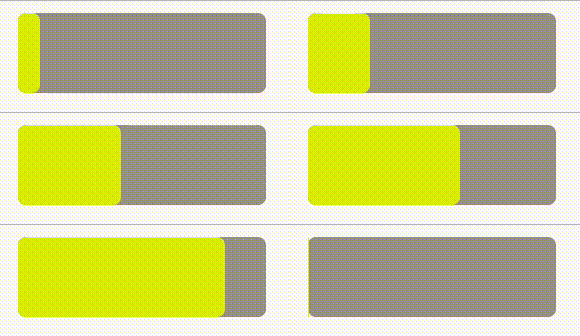
Final result
Our final result will look something like this

Our component
Let's create our component in React. It will contain two divs, one container and one that will perform the animation.
import style from "./ProgressAnimation.module.scss";

const ProgressAnimation = () => (
  <div className={style.container}>
    <div className={style.progress} />
  </div>
);
And our styling will be like this
.container {
  position: relative;
  padding: 0 12px;
  width: 100px;
  height: 40px;
  cursor: pointer;
  background-color: rgb(160, 156, 156);
  border-radius: 4px;

  .progress {
    position: absolute;
    height: 100%;
    width: 100%;
    border-radius: 4px;
    background-color: rgb(223, 238, 11);
    animation: progress 4s ease-in 1;
    left: 0;
  }
}

@keyframes progress {
  from {
    width: 0%;
  }
}
Some notes
-
Our container will have position: relative so the progress div will be wrapped within it since the progress div will have position: absolute.
-
We are basically animating the width from 0% to 100%, and the animation is 4 seconds long and will only do it once. Change to
animation: progress 4s ease-in infinite;
if you want a for ever loading bar.
Outro
There we go. This was a short guide, to demonstrate how we can achieve a simple progress animation in React with only css/scss. I hope you liked it, and thanks for reading.
All the best,
 Thu May 04 2023


