How to create a collapsable list component in React
This tutorial is inspired by the component that we built to have on our articles page, where we group our categories and make them expandable and collapsable based on what you as the user want to be presented with.
So we decided to share this fairly simple component with you guys, with the hope that you find it helpful to you in your own project.
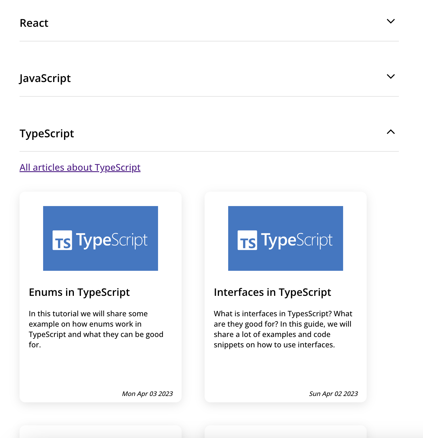
Final result
Below image will show how the component will look after we are done with this tutorial.

Prerequisites
- A react application. We have two great guides on how to create one. Using create-react-app and from scratch.
- Icons that we use can be found here
Implementation
Let's start with creating the component. Create CollapsableList.tsx (or .jsx if you are using JavaScript) in your project.
import { useState } from "react";
import style from "./CollapsableList.module.scss";

interface ICollapsableListProps {
  children: JSX.Element;
  title: string;
  collapsed?: boolean;
}

export const CollapsableList = (props: ICollapsableListProps) => {
  const [isCollapsed, setCollapsed] = useState(Boolean(props.collapsed));

  return (
    <div className={style.list}>
      <div onClick={() => setCollapsed(!isCollapsed)} className={style.header}>
        <div className={style.title}>
          <h3>{props.title}</h3>
        </div>
        <div className={style.iconContainer}>
          <img
            className={style.icon}
            src={isCollapsed ? "/icons/expand.svg" : "/icons/collapse.svg"}
            alt="icon"
          />
        </div>
      </div>
      <div className={style.content}>{isCollapsed ? null : props.children}</div>
    </div>
  );
};
We are using three props for this component.
- children, which is basically the elements you want to be rendered beneath the component.
- collapsed, a optional prop if you want it to be collapsed or expanded. If not set, it will be expanded by default.
- title, our title of the component
We are keeping a local state as well, which will control the collapsed or expanded state of the component. If it is collapsed, we will return null and show the expand icon to tell the user to click to expand it, and if collapse is false, we will render the provided children and change the icon to collapse icon.
Styling
Let's give this component some nice looking UI as well :)
Create CollapsableList.module.scss in your folder. (CSS is also fine if you are not using sass).
.list {
  display: flex;
  flex-direction: column;
  width: 100%;

  .header {
    display: flex;
    align-items: center;
    border-bottom: 1px solid #dfdfdf;
    cursor: pointer;

    .title {
      display: flex;
      flex: 1;
    }

    .iconContainer {
      .icon {
        width: 28px;
        height: 28px;
      }
    }
  }

  .content {
    display: flex;
    flex-direction: column;
  }
}
Consume the component
Now you will go to your component where you want this to be rendered, and then us it like this:
Expanded by default
<CollapsableList title={"Title"}>
  <YourAmazingComponent />
</CollapsableList>
Collapsed by default
<CollapsableList title={"Title"} collapsed>
  <YourAmazingComponent />
</CollapsableList>
Outro
In todays guide we showed a simple way of creating a collapsable list component in React. As stated, these kind of components are great for displaying large amount of data for the user, since they can choose themselves what content they want to see. With this component, you can specify which categories should be default collapsed/expanded in order to give your users the best experience.
I hope you found this guide helpful!
All the best!
 Sat Apr 15 2023


