
Simple analog clock in React with requestAnimationFrame
In todays guide, we will create our own analog watch in React. As a bonus, we will learn to use requestAnimationFrame for our second hand to repaint each second, instead of using setInterval or setTimeout which will make the ticks slow and laggy.
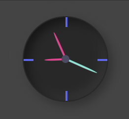
Final result
This is an image of the final result of our analog clock component.
Let's create our Clock.tsx component
I will share the full code below, and explain the important parts after.
import { useCallback, useEffect, useRef, useState } from "react";
import styles from "./Watch.module.scss";

interface IDegrees {
 seconds: number;
 minutes: number;
 hours: number;
}

export const Clock = () => {
 const [degrees, setDegrees] = useState<IDegrees | null>(null);
 const requestRef = useRef<any>();

 const setTime = useCallback(() => {
   const now = new Date();
   const seconds = now.getSeconds() * 6;
   const minutes = now.getMinutes() * 6;
   const hour = now.getHours();

   const hours = 30 * hour + now.getMinutes() / 2;
   setDegrees({ seconds, minutes, hours });
   requestRef.current = requestAnimationFrame(setTime);
 }, []);

 useEffect(() => {
   requestRef.current = requestAnimationFrame(setTime);
   return () => cancelAnimationFrame(requestRef.current);
 }, []);

 return (
   <div className={styles.clock}>
     <div className={styles.centerDot} />
     <div className={styles.twelve} />
     <div className={styles.three} />
     <div className={styles.six} />
     <div className={styles.nine} />
     <div
       className={styles.hourHand}
       style={{ transform: `rotate(${degrees?.hours}deg)` }}
     />
     <div
       className={styles.secondHand}
       style={{ transform: `rotate(${degrees?.seconds}deg)` }}
     />
     <div
       className={styles.minuteHand}
       style={{ transform: `rotate(${degrees?.minutes}deg)` }}
     />
   </div>
 );
};
There we go. Now, let me explain the important parts so you will fully understand what is going on.
-
requestRef will be our reference to the requestAnimationFrame. For everytime we are requesting an animation frame, the current value will get a new value so that we can cancel it when the component is unmounted.
-
setTime is our function that will run recursivly through requestAnimationFrame. Here we are updating our state for the degrees of the hands on the watch. The calculation is as follows: seconds will be the current seconds multiplied by 6. We multiply by six since 60 sec is the full turn around the watch, and 6 * 60 = 360 which is the total degrees. So if we have a current second value of 5 the degree will be 6 * 5 = 30deg.
minutes has the same logic as for the seconds.
hours is little bit different. 1 hour = 30deg on the watch face. 1 minute = 0.5deg on the watch face. So, we take the current hour and multiply by 30 and adding current minutes divided by 2 to get the correct degrees.
-
useEffect will initiate our requestAnimationFrame flow. So when the component is mounted, we will set up the requestAnimationFrame with our setTime as callback. And in setTime we will requestAnimationFrame with setTime as callback again and again. This will cause our ticking animation.
Styling
Now, let's give our clock some styling. Below is the full stylesheet.
.clock {
  position: relative;
  display: flex;
  border-radius: 50%;
  background-color: #282828;
  border: 1px solid #282828;
  height: 85px;
  width: 85px;
  box-shadow: -4px -4px 10px rgba(67, 67, 67, 0.5), inset 4px 4px 10px rgba(0, 0, 0, 0.5),
    inset -4px -4px 10px rgba(67, 67, 67, 0.5), 4px 4px 10px rgba(0, 0, 0, 0.3);

  .centerDot {
    position: absolute;
    top: 50%;
    left: 50%;
    transform: translate(-50%, -50%);
    width: 8px;
    height: 8px;
    background-color: #4d4b63;
    border-radius: 50%;
    z-index: 9;
  }

  .minuteHand {
    position: absolute;
    width: 2px;
    height: 34%;
    top: 15%;
    left: 49%;
    background: #ef3692;
    transform-origin: bottom;
    z-index: 7;

    border-top-left-radius: 50%;
    border-top-right-radius: 50%;
  }

  .secondHand {
    position: absolute;
    width: 2px;
    height: 41%;
    top: 9%;
    left: 49%;
    transform-origin: bottom;
    background: #79e5d6;
    z-index: 8;

    border-top-left-radius: 50%;
    border-top-right-radius: 50%;
  }

  .hourHand {
    position: absolute;
    width: 2px;
    height: 25%;
    top: 25%;
    left: 49%;
    transform-origin: bottom;
    background: #ef3692;
    border-top-left-radius: 50%;
    border-top-right-radius: 50%;
  }

  .twelve {
    position: absolute;
    width: 2px;
    background-color: #5c68f2;
    height: 12%;
    top: 0;
    left: 50%;
    right: 50%;
  }

  .three {
    position: absolute;
    width: 12%;
    background-color: #5c68f2;
    height: 2px;
    top: 50%;
    right: 0;
  }

  .six {
    position: absolute;
    width: 2px;
    background-color: #5c68f2;
    height: 12%;
    bottom: 0;
    left: 50%;
    right: 50%;
  }

  .nine {
    position: absolute;
    width: 12%;
    background-color: #5c68f2;
    height: 2px;
    top: 50%;
    left: 0;
  }
}
As seen, there is a lot of position: absolute; in the styling which is necessary to get all the elements at their right places on the watch face. But if you have been reading my previous posts, you might have seen me mentioned that styling is not really my best skill. Would you have solved it in another way? Please leave me an e-mail with your solution :)
Outro
That's it for this tutorial. So if you find yourself in a situation where you really need an analog clock in your React application, I hope this guide could give you some inspiration :) Hope you enjoyed this guide, and have a wonderful day!
 Wed Apr 26 2023
 Webcam component in React for taking photos that can be downloaded or sent to an APIA tutorial on how we can create a component that accesses the webcam and take photos. We will make the image downloadable and prepare it to be added to form data to POST it to an API.
 Update state in React for objects and arraysA guide on how to work with objects and arrays in React states. We will remove, add and update enitities in the state and explain the cause of mutation in React states.
 Implement an add to cart feature in ReactA tutorial on how to implement an add to cart feature for a webshop, using React, context API and JavaScript
 Create a QR code generator in ReactA tutorial on how to build a QR code generator in React using a free API from Algobook.
 Tabs component in React with icon supportIn this tutorial we will create a Tabs component that we can use in our application for showing different type of content.
 Build a full stack application with React and NodeJsA tutorial on how to build a simple full stack application with React in the client side and NodeJs in the backend.
 How to make pages in React scroll to top automaticallyA short tutorial on how we can make our pages always scroll to the top once navigated to. We will create a custom hook that we can implement in our pages.
 Create a contact us form in React with email integration using a free APIA tutorial on how we can create a contact us form with just using React with a 100% free Email API integration.
 Create a responsive sidebar menu in React with a visibility toggleA tutorial on how to create a responsive sidebar in React with icons, links, visibility toggle and a slide in animation. We will also share example how to get it to work with react router dom using NavLinks.
 A react component for displaying Adsense adsA guide on how we can create a component in react for displaying ads from Adsense
 How to achieve a typing animation on a textA short tutorial on how to achieve a typing animation effect on a text, using css and React.