React cookie consent
A simple responsive cookie consent component for React applications. The component is configurable to support any kind of styling. We also support
- Custom cookie names
- Your own TTL
- slide up animation
- delay before it shows up
- custom icon
- callbacks for accept/deny clicks for additional handling
- clear cookie function
- get cookie value function
Usage
Below, we will demonstrate many types of different configs for the widget
Download
npm i reactjs-cookie-consent
Default
All props are optional, so it can be invoked like this. However, bannerText should probably be changed to a more suitable text that reflects your website.
import { CookieBanner } from "reactjs-cookie-consent";
<CookieBanner />;
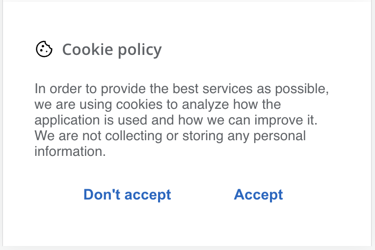
Banner text
To add your own banner text, set the bannerText prop
<CookieBanner
  bannerText="In order to provide the best services as possible, we are using cookies
        to analyze how the application is used and how we can improve it. We are
        not collecting or storing any personal information."
/>
Link text
To set the link text, change the linkText prop
<CookieBanner linkText="Read more at our policy page" />
Button texts
To set the button texts, change the denyText and acceptText props
<CookieBanner denyText="Dismiss" acceptText="Accept all" />
Headline
To set the headline text, change the headline prop
<CookieBanner headline="Cookies and policy" />
With policy link
If you want the policy link to show, set the policyLink prop to the link to your cookie policy page.
<CookieBanner policyLink="/cookiepolicy" />
Custom TTL and cookie name
Decide for yourself how long you want the cookie to live with ttlDays prop. And if you want a custom name of the cookie, provide cookieName with a value.
<CookieBanner ttlDays={120} cookieName="my_cookie_name" />
Callbacks
If you want to do your own handling of the click actions, just provide callback functions that will be called depending on the user action.
<CookieBanner
  onAcceptClick={() => console.log("Accepted")}
  onDenyClick={() => console.log("Denied")}
/>
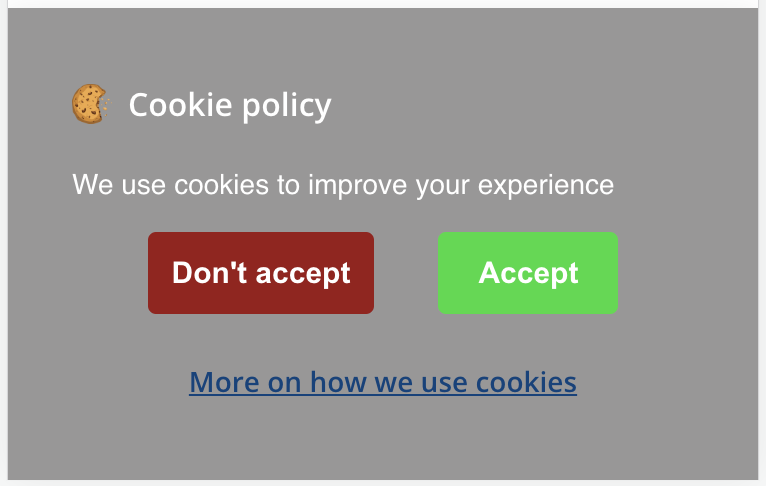
Custom styling
All texts and buttons are stylable. Just provide your own styling object to the respective element.
<CookieBanner
  bannerStyles={{ backgroundColor: "rgb(50 48 48 / 50%)" }}
  headlineStyles={{ color: "white" }}
  textStyles={{ color: "white" }}
  acceptBtnStyles={{ color: "white", backgroundColor: "#19da3b" }}
  denyBtnStyles={{ color: "white", backgroundColor: "#9c1717" }}
  linkStyles={{ color: "#00437d" }}
/>
Delay before it will show
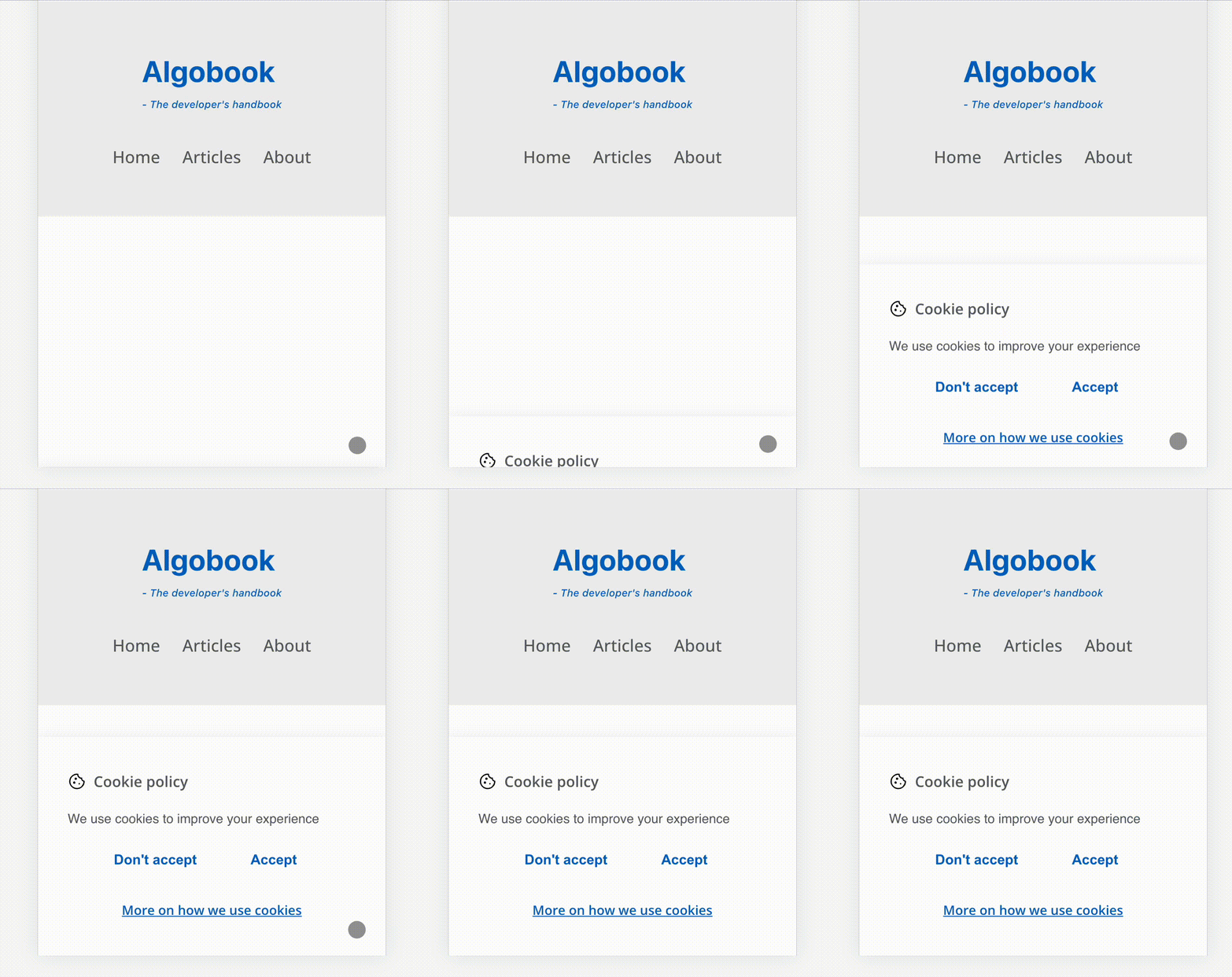
If you want the users to interact with your page for a couple of seconds before they get the banner on their screen, you can pass in a delay time with showDelayMs prop
<CookieBanner showDelayMs={1500} /> // 1,5 seconds
No animation
Per default, there is an animation for sliding up the banner. It can be turned off with withAnimation prop
<CookieBanner withAnimation={false} />
Your own icon
If you want to use your own cookie icon, provide the widget with an iconSrc
<CookieBanner iconSrc="/icons/myCookie.png" />
No icon
If you don't want any icon, just set showDefaultIcon to false
<CookieBanner showDefaultIcon={false} />
Functions
If you want to clear the cookies or get the value of the cookie, we have functions that we provide for that as well. If you are using your own custom cookie name, you must pass in that value in the functions.
import {
  cookieBanner,
  clearConsentCookie,
  getConsentCookie }
from "reactjs-cookie-consent";

  clearConsentCookie(name?) // provide name if you are not using our default
  getConsentCookie(name?) // provide name if you are not using our default
Some images and gifs
We will show some images of how it looks, both per default and with some (really nice) custom styling :)
Default styling, mobile

Desktop, custom icon

Slide up animation on mobile gif (with some delay)

Custom styling desktop

Custom styling mobile

Feedback
Is something missing? Not working? Or any feature requests? Just email us, we love to improve our software. Email can be found here.

